The module <QTCfg> of subsystems "User Interfaces"
| Module: | QTCfg |
| Name: | The system configurator (Qt) |
| Type: | User Interfaces |
| Source: | ui_QTCfg.so |
| Version: | 3.2 |
| Author: | Roman Savochenko, Maxim Lysenko (2009) |
| Description: | Provides the Qtbased configurator of the OpenSCADA system. |
| License: | GPL |
Introduction
The "QTCfg" module provides the configurator of the OpenSCADA system. Configurator is based on multi-platform library of the graphical user interface (GUI) of the firm TrollTech Qt (![]() http://www.trolltech.com/qt).
http://www.trolltech.com/qt).
At the core if the module lies the management interface language of the OpenSCADA system, and thus provides a uniform configuration interface. Update of the module may be required only in the case of updating the specification of the language of the management interface. To request a page context used the group request management interface that allows you to optimize time, for remote access to high latency and slow communication channels.
Lets examine the working window of the configurator in Fig. 1.
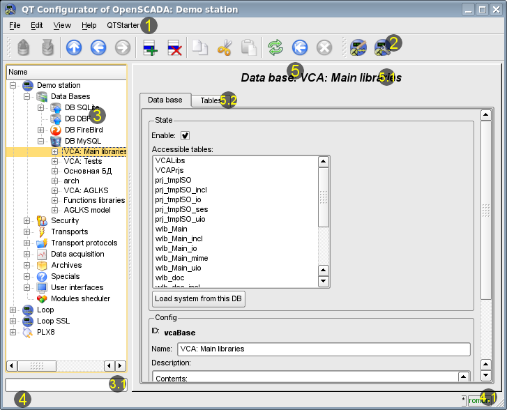
Fig.1. Working window of the configurator
Operating window of the configurator consists of the following parts:
1 Menu contains a drop-down configurator menu.
2 Toolbar contains buttons of quickly control.
3 Navigator is intended for direct navigation of the control tree.
4 Status line indicating the status of the configurator.
5 Workplace field it is divided into parts:
5.2 Tabulator of the working areas the root page (management areas) of the node are placed into the tabulator. The management areas of the following levels are placed on the information panel.
Menu of the configurator contains the following items:
- File the group of general commands:
- Load from DB downloads the selected object or branch of object from the database.
- Save to DB save the selected object or branch of object to the database.
- Close close the configurator window.
- Quit termination of the OpenSCADA system.
- Edit editing commands:
- Add add a new object to the container.
- Delete delete the selected object.
- Copy item copy the selected object.
- Cut item cut of the selected object. The original object is removed after paste.
- Paste item paste of the copied or cut item.
- View navigation and control of the view commands:
- Up climb up the tree.
- Previous open the previous page.
- Next open the following page.
- Refresh refresh the current page.
- Start run periodically update of the contents of the current page with an interval of one second.
- Stop stop periodically update od the contents of the current page with an interval of one second.
- Help assistance call commands:
- About information about the module and the OpenSCADA system.
- About Qt information about the Qt library.
- QTCfg manual call inline or offline manual by the module QTCfg.
- OpenSCADA manual call inline or offline index of links to manuals of the project OpenSCADA.
- The page manual call inline or offline manual of selected page.
- What's this the command of the request the information about the elements of the interface.
The toolbar contains the following management buttons (from left to right):
- Load from DB downloads the selected object or branch of object from the database.
- Save to DB save the selected object or branch of object to the database.
- Up climb up the tree.
- Previous open the previous page.
- Next open the following page.
- Add add a new object to the container.
- Delete delete the selected object.
- Copy item copy the selected object.
- Cut item cut of the selected object. The original object is removed after paste.
- Paste item paste of the copied or cut item.
- Refresh refresh the current page.
- Start run periodically update of the contents of the current page with an interval of one second.
- Stop stop periodically update od the contents of the current page with an interval of one second.
- The page manual call inline or offline manual of selected page.
- Call buttons of the modules of the graphical interface based on the Qt library
In the navigation tree the context menu of following contents is supported:
- Load from DB downloads the selected object or branch of object from the database.
- Save to DB save the selected object or branch of object to the database.
- Add add a new object to the container.
- Delete delete the selected object.
- Copy item copy the selected object.
- Cut item cut of the selected object. The original object is removed after paste.
- Paste item paste of the copied or cut item.
- Refresh the elements of a tree Performs the refreshing of the navigation tree contents.
The control tools are divided into basic, commands, lists, tables and images. All items are displayed in the sequence strictly appropriate to their location in the description of language of management interface.
1. Configuration
To adjust your own behavior in the not obvious situations module provides the ability to customize individual settings through the management interface of the OpenSCADA (Fig. 2). These parameters are:
- Connection check timeouts in seconds '{fail}:{good}' sometime (for SSH tunnels) the checking timeout at a good connection are useful to decrease to 30 seconds in point of the connection holding.
- Initial path to the configurator allows to determine what local page to open when you start the configurator.
- Initial user of the configurator points on behalf of the which user to open configuration without requiring a password.
- The link to the configuration page of the external OpenSCADA stations used to enable the remote configuration.
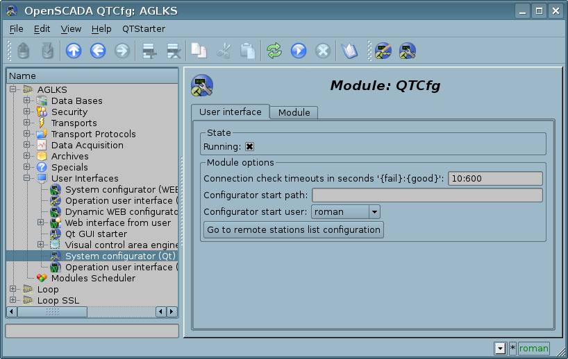
Fig.2. The configuration page of the configurator.
2. Basic elements
Into the number of the basic elements are included: information elements, the field to input values, the elements of combo box, flags, text fields. In the case of absence of an element name, the basic element connects to the previous basic element. Examples of basic elements with the connection is shown in Fig.3.
For input elements that do not mean instant change and may be edited for a long time before a final conclusion, a confirmation mechanism is foretold. This mechanism eliminates the delay when editing, especially in the case of the configuration of remote stations, and to make changes on the confirmation. To elements of input with confirmation include: input line fields of text or numeric values and text fields. Confirmation is made by pressing the button that appears next to the input field after the start of editing.
Input and display text field supports the ability to change the height by setting the bottom edge of the widget and dragging it. In addition the text box supports syntax highlighting, rules which are transmitted in the form of regular expressions from the management interface.
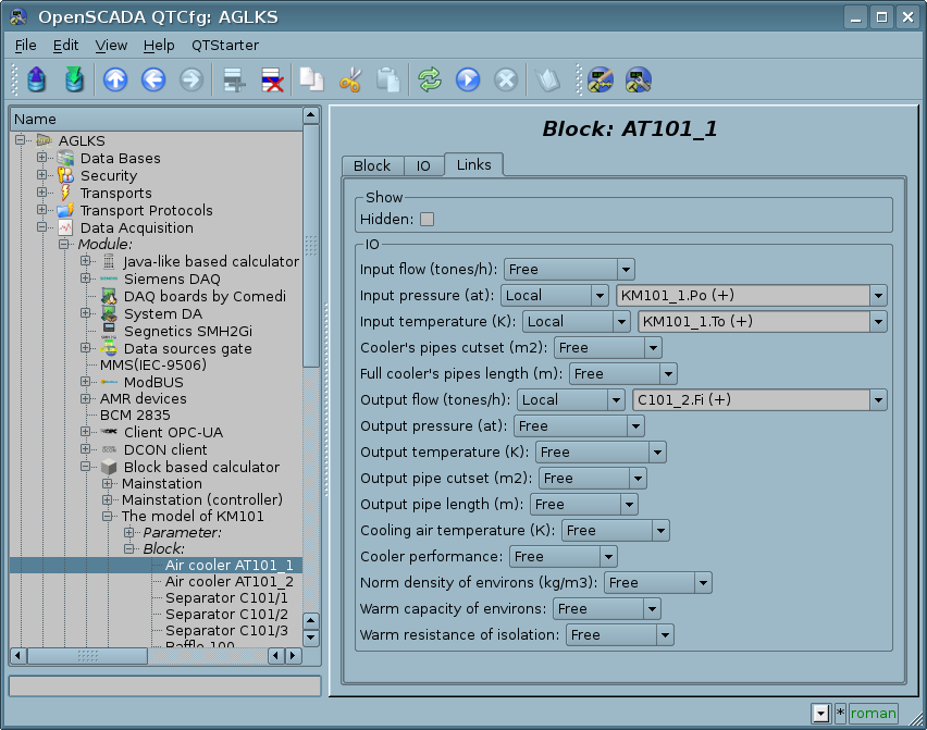
Fig.3. Connection of the basic elements.
3. Commands
Commands are the elements for the transfer of the certain instructions of the action to the node and for the organization of the links on the page. Commands may contain parameters. The parameters are formed from the basic elements. Example of the commands with the parameters is shown in Fig.4.
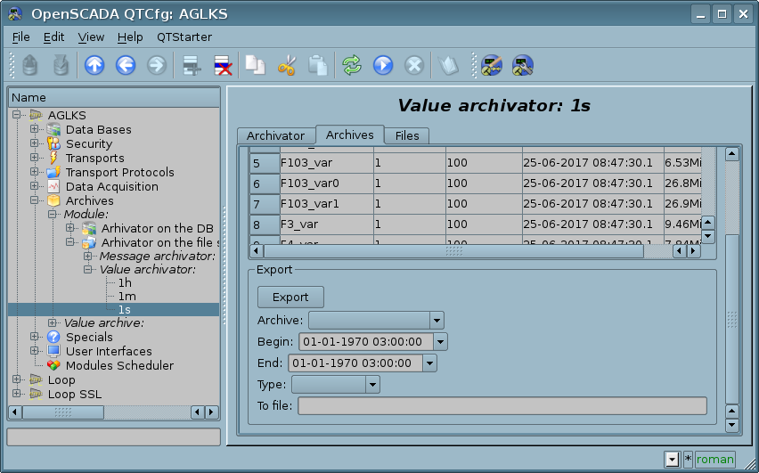
Fig.4. The command.
4. Lists
Lists contain a group of basic elements of the same type. Operations under the elements are accessible via the context menu of the list. Through the elements of the list can be performed the moving operations to other pages. The transition is implemented by double-clicking of the mouse on an element of the list. Lists can be indexed. An example of the list is shown in Fig. 5.
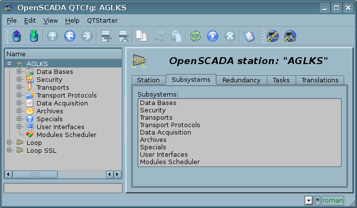
Fig.5. The list.
5. Tables
The tables contain values of the basic elements. Type of the basic element is an individual for each column. Example of the table is given in Fig. 6. Operations on the structure of the table for editable tables are accessible through the context menu. Editing of the table is done by double-clicking on the desired cell.
Tables support the ability to change the height by setting the bottom edge of the widget and dragging it.
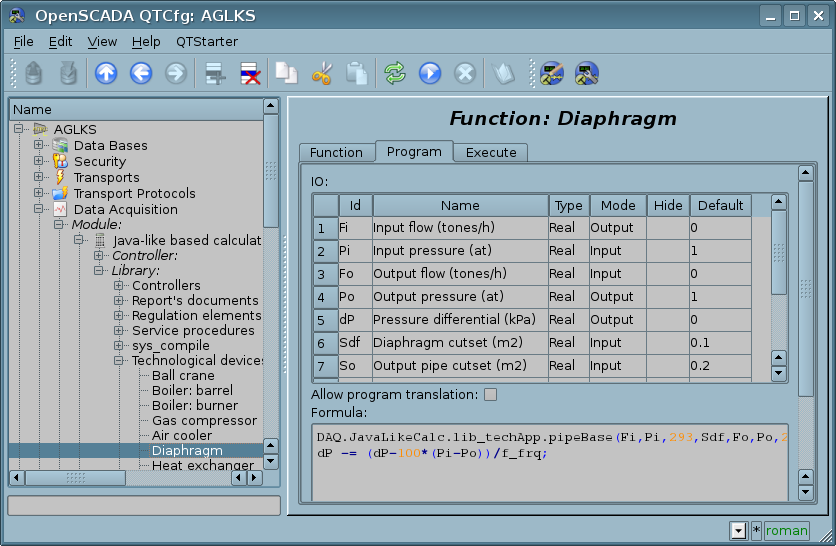
Fig.6. Table.
6. Images
The images are designed to transmit graphic information into the configurators. Example of the image is shown in Fig. 7.
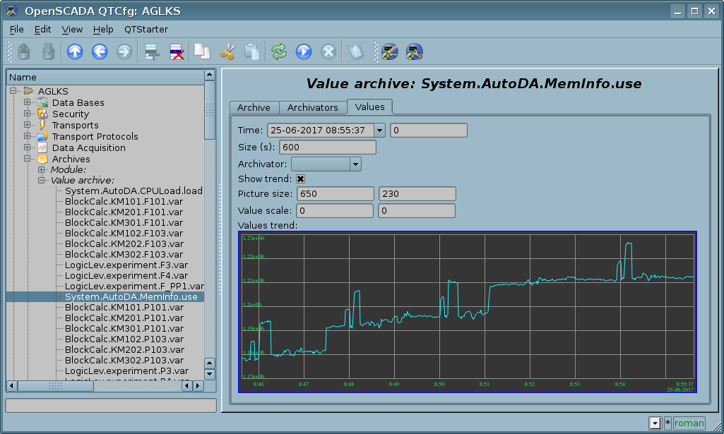
Fig.7. Image.
Links