Main elements library of the user interface
| Name: | wlb_Main |
| Founded: | september 2007 |
| Version: | 1.1.0 |
| State: | Open (GPL) |
| Author: | Roman Savochenko, Maxim Lysenko (2011-2012) |
| Description: | Provides the library of the main elements of the user interface. |
| Address: | DB is in the file: SQLite.vcaBase.wlb_Main ( |
About the library
The library is created to provide mnemonic elements of the user interface. The library is built on the basis primitives of widgets and JavaLikeCalc module, allowing to create calculations on the Java-like language.It is possible to connect the library of mnemonic elements of user interface to the project of the OpenSCADA station by downloading the attached file of the database, placing it in in the database directory of the station's project and creating the database object for the DB module "SQLite", indicating the database file in the configuration.
The library contains about two dozen graphic elements, often sought when forming the user interface of process control. Names and text options are available in three languages: English, Russian and Ukrainian.
1. Analog show (anShow)
The element, shown in Fig. 1, is used to display the current value of the analog parameter and modes of regulator, if the parameter is regulator. Also, this element generates alarms on the relevant parameter settings.Fig.1. "Analog show" widget in the development and runtime modes (left to right).
Using - Development
This widget can be used by developer to create mimics to display the values of analog parameters and PID regulators. To use it you need to add this widget to mimic and link to the data source parameter.Using - Runtime
At runtime mode, you can obtain the passport for parameter by clicking the right mouse button on the body of the widget. The passport will present all the properties of the parameter. Pressing the left mouse button in the body of the widget the control panel will appear parameter, and the selection of this widget will be displayed with blinking frame.Linking attributes
| ID | Parameter | Data type | Config | Config template | Description |
| pErr | Error | String | Input link | Parametr|err | Code and text of the error of the parameter. It is used to generate alarm. The following error codes are processed:
|
| pModeA | Regulator mode (auto) | Boolean | Input link | Parametr|auto | When adjusted on the left of the value the large letter "A" is displayed. |
| pModeC | Regulator mode (cascade) | Boolean | Input link | Parametr|casc | When adjusted on the left of the value the large letter "C" is displayed. |
| pName | Parameter's name | String | Input link | Parametr|NAME | Short name of the parameter displayed over the value. |
| pPrec | Precision | Integer | Input link | Parametr|prec | Number of decimal places for value. |
| pVal | Parameter's value | Real | Input link | Parametr|var | Direct parameter's value. |
| redEVAL | Red parameter name in case of failure | Boolean | Constant | By default, the color of the parameter's name for the "failure" state(EVAL value) is gray. But some critical for the process parameters must have the "failure" state displayed with the red parameter's name. | |
| spName | Speech name | String | Constant | The name of the parameter for speech synthesis during the formation of alarm messages taking into account accents of words, pauses, etc. |
2. Analog show 1 (anShow1)
The element, shown in Fig. 2, is used to display the current value of the analog parameter with a one-character prefix of the type of measured value.Fig.2. "Analog show 1" widget in the development and runtime modes (left to right).
Using - Development
This widget can be used by developer to create mimics to display the values of analog parameters. o use it you need to add this widget to mimic and link to the data source parameter.Linking attributes
| ID | Parameter | Data type | Config | Config template | Description |
| pName | Parameter's name | String | Constant | Parametr|NAME | One-character prefix of the type of measured value. |
| pVal | Parameter's value | Real | Input link | Parametr|var | Direct parameter's value. |
| pPrec | Precision | Integer | Input link | Parametr|prec | Number of decimal places for value. |
3. Element cadr (ElCadr)
The element, shown in Fig. 3, is essentially a universal control panel of various devices:- analogue: indications, manual input values and regulators (analog and pulse);
- discrete: valves, automatic shut off valves, motors, fans and switches.
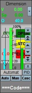
Fig.3. "Element cadr" widget in the development mode.
Using - Development
This widget is not intended for special placement and configuration of the user, as laid down in the "Signal groups" template and if the new project is created from this template, the call of the widget is done automatically, with its display in the control panel area when you select a widget of the parameter, which provides the parameter's control, for example, previously considered "anShow ".Using - Runtime
Fig. 4 shows various examples of this element in the runtime mode.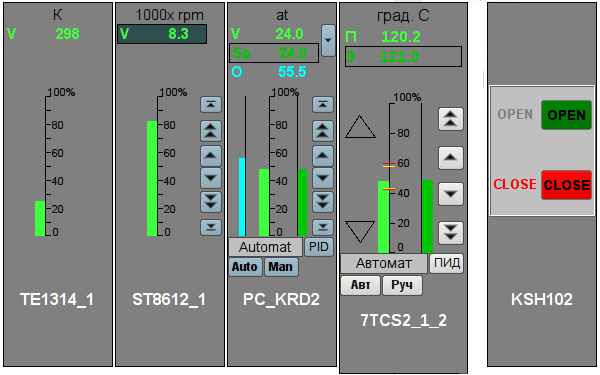
Fig.4. "Element cadr" widget in the runtime mode.
Modes:
- Indications of the analog parameter. In this mode, there is no any control, and there are only units displaying, the value's histogram and the name of the parameter.
- Manual input of an analog parameter. In addition to displaying indications of analog parameters the buttons to enter a new value are displayed. Enter of the value is displayed in the field at the top, in the white rectangle. To validate the input, press the left mouse button in the area of white rectangle. Without validation the typed value will be reset after a few seconds.
- PID regulator's mode. To the value of a variable and its histogram are added values and histograms of set point and out of the PID regulator, the buttons to enter a new value of the set point or out, as well as the mode adjustment button and the field to display the current mode. Also, for the user with appropriate privileges it is available the button to go to the frame to set the coefficients of PID regulator. In the case of pulsed PID instead of histogram of the analog output it is displayed the status of pulse output with the help of triangles "Up" and "Down" and the manual entry of output leads to direct formation of pulse, respectively down or up.
- Mode of a discrete device. In this mode the name of the parameter and the field of discrete building of the parameter are displayed. The field of discrete building contains the current state of discrete device on the left and the buttons of commands on the right. There are two states of the device: "Open", "Closed" and the three commands: "Open", "Close", "Stop". The names of states and commands can be adjusted during set up. Changing the state of the logic device is determined by pressing the corresponding command.
Every action on this panel (change of PID set point, state of the discrete parameter ...) is recorded in the actions log by the generation of appropriate messages.
For any displayed or controlled parameter the passport can be obtained in runtime mode by clicking the right mouse button on the contour field. The passport will present to all the properties of the parameter.
Linking attributes
| ID | Parameter | Data type | Config | Config template | Description |
| prmId | Parameter:identifier | String | Input link | Parametr|SHIFR | Parameter's identifier is used to place the record the operator's actions to the report. |
| prmShifr | Parameter:code | String | Input link | Parametr|NAME | Short name of the parameter, code. It is placed below the frame. |
| prmDescr | Parameter:description | String | Input link | Parametr|DESCR | Description of the parameter is used to place the record the operator's actions to the report. |
| prmColor | Parameter:border color | String | Input link | Parametr|color | Sets the border color of the contour. |
| Parameters of Analog Device | |||||
| prmDemention | Parameter:dimension variable | String | Input link | Parametr|ed | |
| prmPrec | Precision | Integer | Input link | Parametr|prec | Number of decimal places in parameter, step change for the manual input of values, as well as set point and out of the PID regulator. |
| prmVar | Parameter:variable | Real | Full link | Parametr|var | Directly to the analog value of the parameter. |
| max | Parameter:maximum | Real | Input link | Parametr|max | Upper limit value of the parameter. |
| min | Parameter:minimum | Real | Input link | Parametr|min | Minimum limit values of the parameter. |
| prmAMax | Upper alarm border | Real | Input link | Parametr|aMax | |
| prmAMin | Lower alarm border | Real | Input link | Parametr|aMin | |
| prmWMax | Upper warning border | Real | Input link | Parametr|wMax | |
| prmWMin | Lower warning border | Real | Input link | Parametr|wMin | |
| Manual Analog Input | |||||
| prmVarIn | Parameter:variable input | Real | Full link | Parametr|varIn | Output for manual input of an analog value of the parameter. The presence of this parameter is an indication that the parameter - is determined as "Manual analog input. |
| PID regulator | |||||
| prmAnalog | Parameter:analog regulator | Boolean | Input link | Parametr|analog | Sign of the analog regulator, in case of the absence of this parameter the regulator is an analog one. |
| prmAuto | Parameter:automate | Boolean | Full link | Parametr|auto | Mode of the regulator, "Automatic". |
| prmCasc | Parameter:Cascade | Boolean | Full link | Parametr|casc | Mode of the regulator, "Cascade". |
| prmSp | Parameter:set point | Real | Full link | Parametr|sp | PID regulator's set point, it can be set by the user. |
| prmImpQdwnTm | Parameter:imp. out down | Boolean | Input link | Parametr|impQdwn | Output "Down" for impulse regulator. |
| prmImpQupTm | Parameter:imp. out up | Boolean | Input link | Parametr|impQup | Output "Up" for impulse regulator. |
| prmOut | Parameter:output | Real | Full link | Parametr|out | Analog PID regulator output for display and manual input of the output value of PID in manual mode. |
| prmManIn | Parameter:manual input | Real | Full link | Parametr|manIn | Manual input of the new output value of PID regulator in manual mode. |
| Parameters of discrete devices | |||||
| prmCom | Parameter: Command - "Open" | Boolean | Full link | Parametr|com | |
| prmClose | Parameter: Command - "Close" | Boolean | Full link | Parametr|close | |
| prmStop | Parameter: Command - "Stop" | Boolean | Full link | Parametr|stop | |
| prmOpenSt | Parameter: State - "Opened" | Boolean | Input link | Parametr|st_open | |
| prmCloseSt | Parameter: State - "Closed" | Boolean | Input link | Parametr|st_close | |
| digComs | Parameter:digital commands | String | Input link | Parametr|digComs | Names and colors of buttons of commands in the format: {On}[-color]:{Off}[-color][:{Stop}[-color]]. Default colors are: green, red and yellow. |
| digStts | Parameter:digital states | String | Input link | Parametr|digStts | Names and colors of labels of states in the format: {On}[-color]:{Off}[-color]. Default colors are: green and red. |
4. Contours group (grpCadr)
Element, shown in Fig. 5, provides for simultaneous monitoring and control of several contours up to eight, includes both instances of the widget "Element cadr for each contour, and a widget "Diagram" to monitor the trends of the contours and viewing history .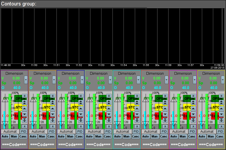
Fig.5. "Contours group" widget in the development mode.
Using - Development
This widget is designed to perform the role of page-template, and should therefore be placed directly in the project's tree. The project-template "signal groups" for each signal object that widget-frame is included in the role of a template that allows you to create on its basis a set of pages of groups of contours. For each widget-frame, it can be connected up to eight parameters by setting the links. Contours for which there is no set links will be hidden at runtime.Using - Runtime
In runtime mode, the contours and trends, for which links have been set, are displayed. Control of the parameters by contours, respectively described in detail in the section of the "Element cadr (ElCadr)" widget. In addition to this you can control the trends display properties, which requires the left mouse button to click in the trend's area and by means of appeared trend's control panel to make the necessary actions.Fig. 6 is an example of this element in the runtime mode.
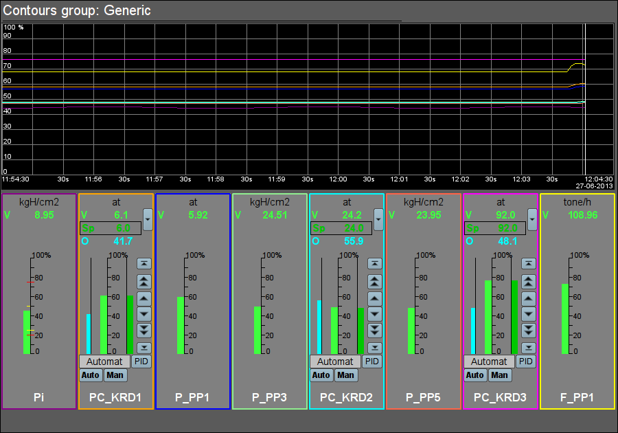
Fig.6. "Contours group" widget in the runtime mode.
Linking attributes
| ID | Parameter | Data type | Config | Config template | Description |
| grpName | Group name | String | Constant | Group's name | |
| Element {n} from 1 to 8. | |||||
| el{n} | The list of linking parameters corresponds to the list of the "Element cadr (ElCadr)" widget | ||||
5. Views page's element (ElViewCadr)
Element, shown in Fig. 7, serves as the basis for overview frames panel and is not usually used independently. Element reflects the text information about a parameter in the form of the name and value, and a graph (trend) of the parameter for a small (adjustable) period of time to observe the current trend of the parameter with auto-scaling on the value's scale.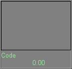
Fig.7. "Views page's element" widget in the development mode.
Using - Development
Though this widget is not intended for independent use, in isolation from frames panel, it can be used, for example, by placing it to the mimic and linking with the data source parameter.Using - Runtime
At runtime mode, you can obtain the passport for parameter by clicking the right mouse button on the body of the widget. The passport will present all the properties of the parameter. Pressing the left mouse button in the body of the widget the control panel will appear parameter, and the selection of this widget will be displayed with blinking frame.Fig. 8 shows various examples of this element in the runtime mode.
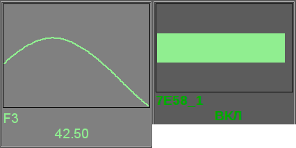
Fig.8. "Views page's element" widget in the runtime mode.
Linking attributes
| ID | Parameter | Data type | Config | Config template | Description |
| name | Name | String | Input link | Parametr|NAME | Parameter name, code, for display in the name's field. |
| addr | Address | Address | Input link | Parametr|var | Address to the attribute of the parameter's values for trend's building. |
| var | Variable | Real | Input link | Parametr|var | Direct value of the parameter to display in value's field. |
6. Overview frames panel (ViewCadr)
Element, shown in Fig. 9, serves to show the current trends for the parameters of the signal object up to 24 pieces, supports scaling elements depending on their number. Consists of widgets "views page's element (ElViewCadr)".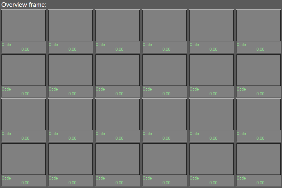
Fig.9. "Overview frames panel" widget in the development mode.
Using - Development
This widget is designed to perform the role of template-page, and should therefore be placed directly in the project's tree. The project-template "signal groups" for each signal object that widget-frame is included in the role of a template that allows you to create on its basis a set of pages of groups of overview frames panel. To each widget-frame can be connected to the 24-parameter by setting the links. Trends for which there is no set links will be hidden at runtime, and when it is necessary the expansion and scaling of linked ones will be done to fill the area of the widget.Using - Runtime
In the runtime mode the trends' contours are displayed, for which links have been set. Control of the parameters from contours, respectively described in details in the section "views page's element (ElViewCadr)" widget.Fig. 10 shows an example of this element in the runtime mode.
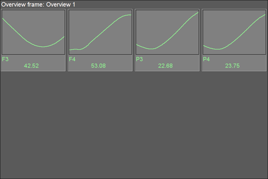
Fig.10. "Overview frames panel" widget in the runtime mode.
Linking attributes
| ID | Parameter | Data type | Config | Config template | Description |
| name | Name | String | Constant | Frame's name | |
| Element {r}_{c}, where {r} - rows from 1 to 4 and {c} - columns from 1 to 6. | |||||
| el{r}_{c} | The list of linked parameters corresponds to the list of ones of the "Views page's element (ElViewCadr)" widget | ||||
7. Graphics group element (ElViewGraph)
Element, shown in Fig. 11, is provided to create graphics groups. Element contains information about a parameter, the regulator's mode if the parameter is such, the units of analog parameter, as well as the color corresponding to the parameter's trend.
Fig.11. "Graphics group element" widget in the development mode.
Using - Development
Though this widget is not intended for independent use, in isolation from graphics groups, it can be used, for example, by placing it to the mimic and linking with the data source parameter.Using - Runtime
At runtime, except the available visual data, provided by a number of control elements:- "Selection" — by pressing the left mouse button in the area of the widget will appear right control panel, and choice of the widget will display a flashing border.
- "Hide/Show" — by double-clicking on the widget it is changed to show or hide a graph of a given element.
- "Context menu functions" — by context menu allowed some functions:
- "Passport" — getting passport for the parameter. In the passport will present all it properties.
- "Hide/Show" — switching display or hide a graph of a given element, like a double click.
- "Show (single)" — a single graph showing for selected item in its native scale, by hiding all other elements in group.
- "Show (All)" — showing all graphs the parameters in group.
- "Select" — call parameter selection dialog from a list available to choose, from the attribute "Allow for select parameters" of this or the root widget. This item is available only in the presence of the selection list.
Fig. 12 shows various examples of this element in the runtime mode.

Fig.12. "Graphics group element" widget in the runtime mode.
Linking attributes
| ID | Parameter | Data type | Config | Config template | Description |
| name | Name | String | Input link | Parametr|NAME | Parameter name, code, for display in the name's field. |
| addr | Address | Address | Input link | Parametr|var | Address to the attribute of the parameter's values for trend's building. |
| color | Trends color | String | Constant | ||
| Parameters of Analog Device | |||||
| ed | Dimension | String | Input link | Parametr|ed | |
| prec | Precision | Integer | Input link | Parametr|prec | Number of decimal places in parameter. |
| max | Maximum | Real | Input link | Parametr|max | Upper limit value of the parameter. |
| min | Minimum | Real | Input link | Parametr|min | Minimum limit values of the parameter. |
| aMax | Upper alarm border | Real | Input link | Parametr|aMax | |
| aMin | Lower alarm border | Real | Input link | Parametr|aMin | |
| wMax | Upper warning border | Real | Input link | Parametr|wMax | |
| wMin | Lower warning border | Real | Input link | Parametr|wMin | |
| pModeA | "Automate" regulator's mode | Boolean | Input link | Parametr|auto | Mode of the regulator, "Automatic". |
| pModeC | "Cascade" regulator's mode | Boolean | Input link | Parametr|casc | Mode of the regulator, "Cascade". |
| Parameters of discrete devices | |||||
| digComs | Digital commands | String | Input link | Parametr|digComs | Names and colors of buttons of commands in the format: {On}[-color]:{Off}[-color][:{Stop}[-color]]. Default colors are: green, red and yellow. |
| digStts | Digital states | String | Input link | Parametr|digStts | Names and colors of labels of states in the format: {On}[-color]:{Off}[-color]. Default colors are: green and red. |
| digRevers | Revers | Boolean | Constant | Discrete signal reverse. | |
8. Graphics group (grpGraph)
Element, shown in Fig. 13, is provided for simultaneous observation of a trend and control the parameters of the signal object, includes both instances of the widget "Graphics group element (ElViewGraph) " for each parameter and widget "Diagram" to monitor the parameters' trends and browsing history, and also scroll bar for fast navigation on allowed history of selected parameters for show.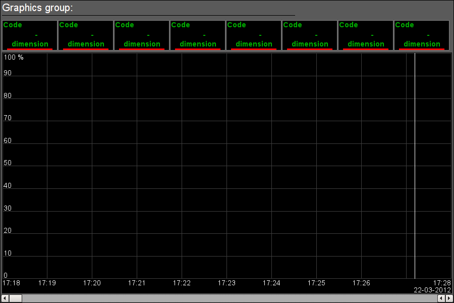
Fig.13. "Graphics group" widget in the development mode.
Using - Development
This widget is designed to perform the role of page-template, and should therefore be placed directly in the project's tree. The project-template "signal groups" for each signal object that widget-frame is included in the role of a template that allows you to create on its basis a set of pages of graphics group. For each widget-frame, it can be connected up to eight parameters by setting the links. Trends for which there is no set links will be hidden at runtime or allowed for user's selection at case allowing parameters for selection list in attribute "Allow for select parameters" (list format described into parameters selection dialog).Using - Runtime
In runtime mode, the trends, for which links have been set, are displayed. Control of the parameters from the text elements of the trends, respectively described in detail in the section of the "Graphics group element (ElViewGraph)" widget. In addition to this you can control the trends display properties, which requires the left mouse button to click in the trend's area and by means of appeared trend's control panel to make the necessary actions.Fig. 14 shows an example of this element in the runtime mode.
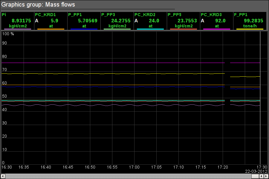
Fig.14. "Graphics group" widget in the runtime mode.
Linking attributes
| ID | Parameter | Data type | Config | Config template | Description |
| grpName | Group name | String | Constant | Group name | |
| Element {n} from 1 to 8. | |||||
| el{n} | The list of linking parameters corresponds to the list of the "Graphics group element (ElViewGraph)" widget | ||||
9. Result graphic's element (ResultGraphEl)
Element, shown in Fig. 15, is provided to create result graphics. Element allows you to display trends on the five parameters for a specified period of time till the current time.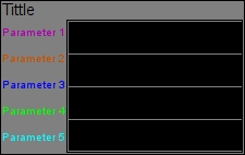
Fig.15. "Result graphic's element" widget in the development mode.
Using - Development
Though this widget is not intended for independent use, in isolation from result graphics, it can be used, for example, by placing it to the mimic and linking with the data source parameter.Fig. 16 shows an example of this element in the runtime mode.
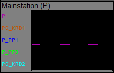
Fig.16. "Result graphic's element" widget in the runtime mode.
Linking attributes
| ID | Parameter | Data type | Config | Config template | Description |
| title | Title | String | Constant | It is displayed above the graph. If the title is missing the trend's field will expand up. | |
| Trend {n} from 1 to 5. | |||||
| p{n}_addr | Parameter{n}:address | Address | Input link | Parametr_{n}|var | Address to the value's attribute for {n} trend's building. |
| p{n}_clr | Parameter{n}:color | Color | Constant | Parametr_{n} | |
| p{n}_max | Parameter{n}:maximum | Real | Input link | Parametr_{n}|max | Upper limit of the trend. |
| p{n}_min | Parameter{n}:minimum | Real | Input link | Parametr_{n}|min | Lower limit of the trend. |
| p{n}_name | Parameter{n}:name | String | Input link | Parametr_{n}|NAME | The short name of the parameter to display in the field on the left. |
10. Result graphics (ResultGraph)
Element, shown in Fig. 17, is used to display the trends of the parameters of the whole visualization project.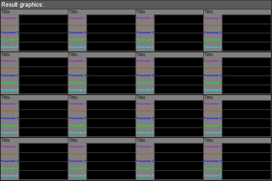
Fig.17. "Result graphics" widget in the development mode.
Using - Development
This widget is designed to perform the role of page-template, and should therefore be placed directly in the project's tree. In the project-template "signal groups" on the root page level there is special virtual page "Result graphics" with the result graphics template, that allows you to create on its basis a set of pages of result graphics. To each widget-frame can be connected to the 16*5 parameters by setting the links. Trends, for which there is no set links, will be hidden at runtime, and when it is necessary the expansion and scaling of linked ones will be done to fill the area of the widget.Using - Runtime
In runtime the contours of the trends, for which the links are set, are displayed.Fig. 18 shows an example of this element in the runtime mode.
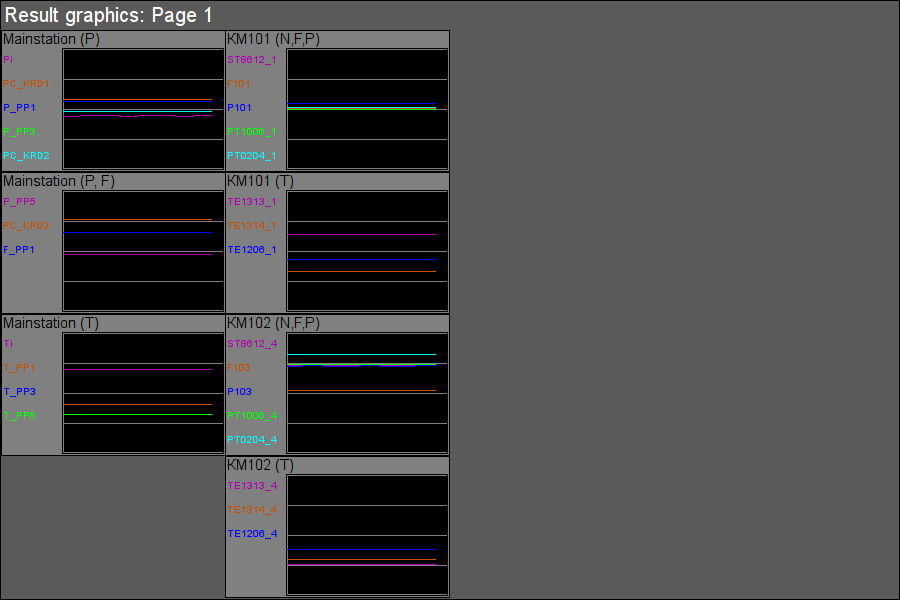
Fig.18. "Result graphics" widget in the runtime mode.
Linking attributes
| ID | Parameter | Data type | Config | Config template | Description |
| grpName | Group name | String | Constant | Group name | |
| Element {n} from 1 to 16. | |||||
| el{n} | The list of linking parameters corresponds to the list of the "Result graphic's element (ResultGraphEl)" widget. | ||||
11. Regulator's control panel (cntrRegul)
Element, shown in Fig. 19, is used for adjustment of PID regulator, includes information about the parameter-regulator, fields of the regulator's settings, and the "Diagram" widget to monitor the trends of the regulator and browsing history.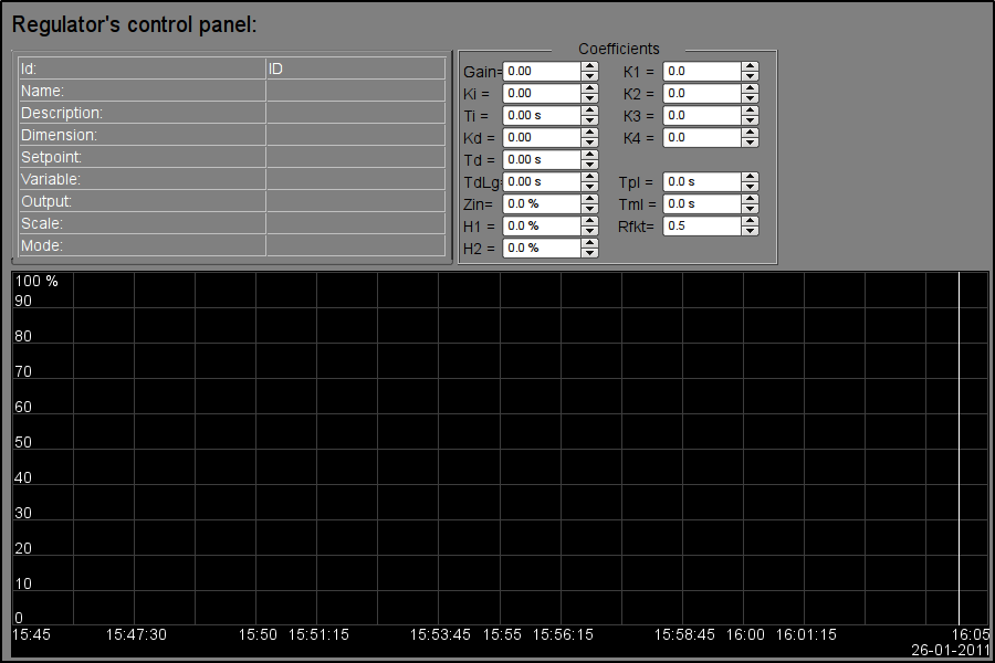
Fig.19. "Regulator's control panel" widget in the development mode.
Using - Development
This widget can be used as a panel, called from the control of panel of the parameters "ElCadr", as well as a template-page. Widget should be placed directly in the project's tree, namely to the panels' container, where the dynamic linking will be implemented to the regulator's parameter. To create the static list of the regulator's settings contours, with the possibility of paging in it, you must place them in a container of regulator's contours "greg" of each signal object and statically link them with the corresponding parameter, and to ensure equality of the panel's ID and linked parameter.Using - Runtime
In the runtime mode the following fields are displayed:- name of the regulator's parameter;
- field with the properties of regulator consisting of: identifier, name, description, units, set point, variable output, scale and mode;
- coefficients of regulator's settings: Kp, Ki, Ti, Kd, Td, Tzd, Zi, H1, H2, K1, K2, K3, K4, Tpl, Tml и Rfkt.
- area of the diagram with displaying trends: variable (green), set point (blue), the analog output (cyan), regulator's mode "Automatic" (magenta) and digital outputs.
Users have the ability to change the PID regulator's coefficients: mode, set point, out and immediately to see the reaction on the diagram. In addition, the user can learn the history of the regulator, which requires the left mouse button click in the graph area and by means of appeared trend's control panel to make the necessary navigation actions. To return the control panel of the parameter the left mouse button to click in an empty area of the frame is required.
Fig. 20 shows an example of this element in the runtime mode.
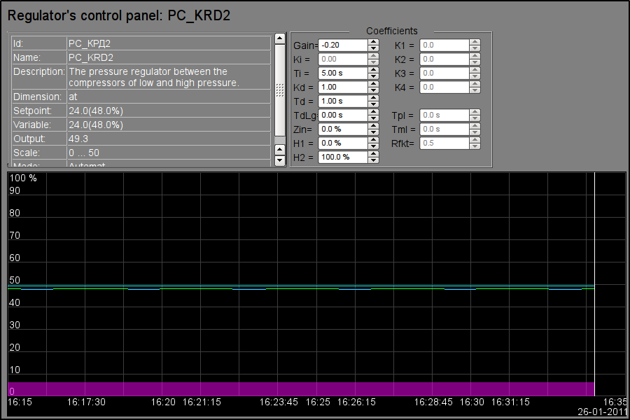
Fig.20. "Regulator's control panel" widget in the runtime mode.
Linking attributes
| ID | Parameter | Data type | Config | Config template | Description |
| SHIFR | Code | String | Input link | Parameter|SHIFR | |
| NAME | Name | String | Input link | Parameter|NAME | |
| DESCR | Description | String | Input link | Parameter|DESCR | |
| max | Scale maximum | Real | Input link | Parameter|max | |
| min | Scale minimum | Real | Input link | Parameter|min | |
| ed | Units | String | Input link | Parameter|ed | |
| prec | Precision | Integer | Input link | Parametr|prec | Number of decimal places in value and set point of the PID. |
| var | Variable | String | Input link | Parameter|var | |
| var_addr | Variable address | Address | Input link | Parameter|var | Address for the trend's building of the value. |
| PID - regulator | |||||
| auto_addr | Mode | Address | Input link | Parameter|auto | Address for the "Automate" mode trend's building. |
| sp | Set point | Real | Input link | Parameter|sp | |
| sp_addr | Set point address | Address | Input link | Parameter|sp | Address for the trend's building of the set point. |
| out | Out | Real | Input link | Parameter|out | |
| out_addr | Out address | Address | Input link | Parameter|out | Address for the trend's building of the analog output. |
| Hdwn | Bottom output border | Real | Full link | Parameter|Hdwn | Restricting the values of the analog output on the bottom. |
| Hup | Top output border | Real | Full link | Parameter|Hup | Restricting the values of the analog output on the top. |
| Kp | Gain coefficient | Real | Full link | Parameter|Kp | |
| Ki | Coeff. of integration | Real | Full link | Parameter|Ki | |
| Ti | Integration time | Real | Full link | Parameter|Ti | |
| Kd | Coeff. of differential | Real | Full link | Parameter|Kd | |
| Td | Differentiation time | Real | Full link | Parameter|Td | |
| Tzd | Differential part lag time | Real | Full link | Parameter|Tzd | |
| Zi | Insensitivity area | Real | Full link | Parameter|Zi | |
| K1 | Input 1 coefficient | Real | Full link | Parameter|K1 | |
| K2 | Input 2 coefficient | Real | Full link | Parameter|K2 | |
| K3 | Input 3 coefficient | Real | Full link | Parameter|K3 | |
| K4 | Input 4 coefficient | Real | Full link | Parameter|K4 | |
| Pulse PID - regulator | |||||
| impQup_addr | Address of impulse output up | Address | Input link | Parameter|impQup | Address for the trend's building of the pulse output "Up". |
| impQdwn_addr | Address of impulse output down | Address | Input link | Parameter|impQdwn | Address for the trend's building of the pulse output "Down". |
| KImpRfact | Rate factor | Real | Full link | Parameter|KImpRfact | The asymmetry in the generation of pulse-width up and down. |
| TImpMin | Minimal impulse time | Integer | Full link | Parameter|TImpMin | There will be generated impulses, starting with the specified width. |
| TImpPer | Impulses period | Integer | Full link | Parameter|TImpPer | Frequency of repetition of pulse generation. |
12. Root page (SO) (RootPgSo)
The "Root page" element, shown in Fig. 21, serves as the basis for creating the process control user interfaces, grounded on the signal object. The root page contains four areas:- "Buttons-indicators area of the signal objects" (above) — is to provide information on the availability of alarms in the signal object and also to switch between them.
- "Buttons-modes of presentation area" (right-top) — indication of the selection and selection the presentation modes, such as: "Mnemo", "Graphics group", "Contours group", "Documents", etc. It also contains the quittance buttons that appear in the event of alarms and the page turning button of the mnemonic schemes.
- "Container of the mnemonic schemes and the basic frames of the operator interface" (center) — region of the container to place mnemonic schemes and basic frames at their selection by presentation modes buttons or at the change of the signal object.
- "Control panels container" (right-bottom) — region of the container to place control panels of various objects in the container of mnemonic schemes, for example: panel of the parameter, document, graphic (trend), etc.
Under control panels container placed button for demo mode start — mode on which performed periodic switching for representative frames, changing regime and other operations by scenario.
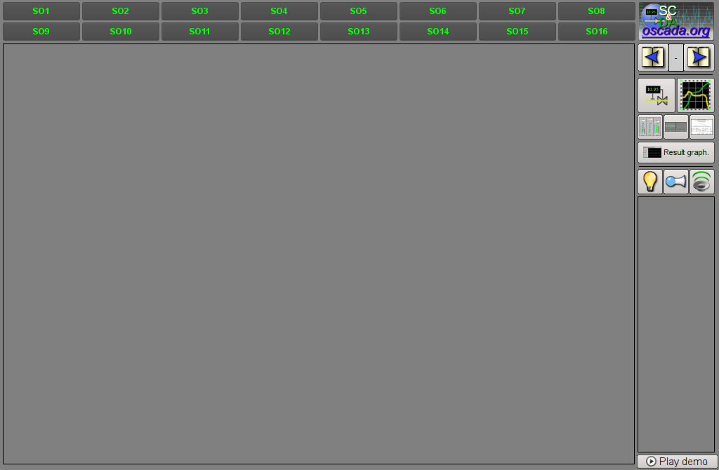
Fig.21. "Root page (SO)" widget in the development mode.
Using - Development
This widget can be used only in the root page mode that should be placed in the project's tree as an element "/*/so". In addition, around the main page should be made following tree hierarchy:- "/*/control" - logical container containing a variety of control panels;
- "/*/so/{n}" - logical container of the signal object {n} (1 ... 16) contains the containers and the templates of presentation modes;
- "/*/so/{n}/mn" - logical container of the mnemonic schemes of the signal object contains many pages of final mnemonic schemes;
- "/*/so/{n}/ggraph" - graphics group template contains many pages of final graphics groups;
- "/*/so/{n}/gcadr" - contours group template contains many pages of final contours groups;
- "/*/so/{n}/gview" - overview frames panel template contours group overview frames groups;
- "/*/so/{n}/doc" - document's logical container contains many pages of the final documents;
- "/*/so/{n}/greg" - PID regulator's control panel page's template contains many pages of final PID regulators, statically linked;
- "/*/so/rg" - logical container result graphics - summary graphics for the operator interface;
- "/*/so/rg/rg" - result graphics template contains many pages of final result graphics.
At demo mode present you should into attribute "Procedure play demo" describe demo procedure on internal language OpenSCADA DAQ.JavaLikeCalc. For example bellow led demo procedure of "Dynamic model AGLKS":
stepCur++; stepTm = 20;
//>> Open main mnemo
if(stepCur == 0)
{
	this.pg_1.pg_mn.pg_1.attrSet("pgOpen",true);
	this.attrSet("tipStatus","Main mnemo open.");
}
//>> Open main graphics
else if(stepCur == 1)
{
	this.pg_1.pg_ggraph.pg_1.attrSet("pgOpen",true);
	this.attrSet("tipStatus","Main graphics open.");
}
//>> Setpoint set more for PC KRD1
else if(stepCur == 2)
{
	SYS.DAQ.BlockCalc.Anast1to2node_cntr.PC_КРД1.sp.set(6);
	this.attrSet("tipStatus","The regulator PC_KRD1 setpoint increase.");
}
//>> Open contours group
else if(stepCur == 3)
{
	this.pg_1.pg_gcadr.pg_1.attrSet("pgOpen",true);
	this.attrSet("tipStatus","Contours group open.");
}
//>> Open overview cadr
else if(stepCur == 4)
{
	this.pg_1.pg_gview.pg_1.attrSet("pgOpen",true);
	this.attrSet("tipStatus","Overview frame open.");
}
//>> Open document
else if(stepCur == 5)
{
	this.pg_1.pg_doc.pg_1.attrSet("pgOpen",true);
	this.attrSet("tipStatus","Document open.");
}
//>> Open result graphics
else if(stepCur == 6)
{
	this.pg_rg.pg_rg.pg_1.attrSet("pgOpen",true);
	this.attrSet("tipStatus","Result graphics open.");
}
//>> Open mnemo for KM101
else if(stepCur == 7)
{
	this.pg_2.pg_mn.pg_KM101.attrSet("pgOpen",true);
	this.attrSet("tipStatus","Mnemo KM101 open.");
}
//>> Open graphics for KM101
else if(stepCur == 8)
{
	this.pg_2.pg_ggraph.pg_1.attrSet("pgOpen",true);
	this.attrSet("tipStatus","Graphics КМ101 open.");
}
//>> Open PID-control panel
else if(stepCur == 9)
{
	this.ownerSess().pg_control.pg_ElCadr.attrSet("pgOpenSrc",this.pg_1.pg_mn.pg_1.wdg_PC1.attr("path"));
	this.attrSet("tipStatus","The parameter PC_KRD1 control panel open.");
	stepTm = 1;
}
//>> Open PID-control page
else if(stepCur == 10)
{
	this.ownerSess().pg_control.pg_cntrRegul.attrSet("pgOpenSrc",this.ownerSess().pg_control.pg_ElCadr.attr("path"));
	this.attrSet("tipStatus","The regulator PC_KRD1 control panel open.");
}
//>> Setpoint restore for PC KRD1
else if(stepCur == 11)
{
	SYS.DAQ.BlockCalc.Anast1to2node_cntr.PC_КРД1.sp.set(5.8);
	this.attrSet("tipStatus","The regulator PC_KRD1 setpoint restore.");
}
else { stepCur = -1; stepTm = 0; }
If there is no demo mode need to on the project page, the frame, turn off the button to start the demonstration and the field of control panels extend.
Using - Runtime
In the runtime mode, the user can select the desired from available signal object (Ctrl+1...0), select the type of presentation (Ctrl+M,G,C,V,D,R), make the quittance of alarms, and also cause the control panel for the the desired element. After choosing, the user is presented the mnemonic scheme or common frame in the mnemonic schemes container and control panel in the control panels container. Then the user can observe the state on mnemonic schemes and panels, as well as to the make actions provided by them.Fig. 22 shows an example of this element in the runtime mode.
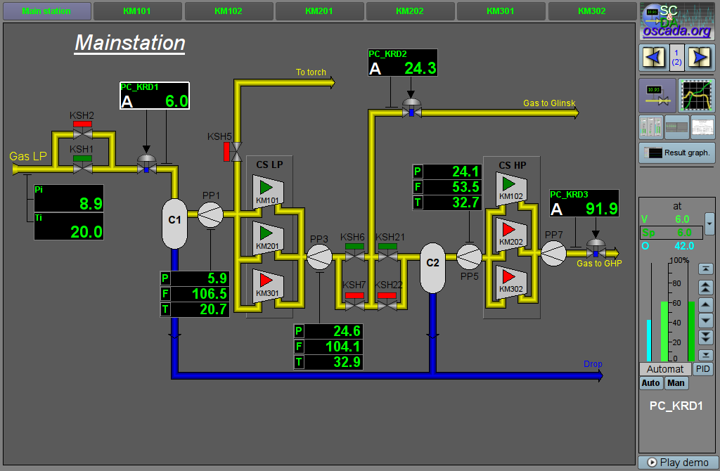
Fig.22. "Root page (SO)" widget in the runtime mode.
13. Passport (cntrPasp)
Element, shown in Fig. 23, is provided for displaying the parameter's passport: detailed information, including code, description, units, alarm borders, etc. Document is generated entirely dynamically.Using - Development
This element should be placed in a logical container of the project's tree. In development mode, the widget is a blank "Document", and therefore the only screen shot with this widget in the runtime mode of the project is provided. Linking with the parameter is made dynamically when you call "Passport" for the visual elements of the parameter.Using - Runtime
Calling the passport is made from the visual elements of parameter, for example: by right click of the mouse on the element "analog parameter" (anShow) and on the field of the "element cadr" widget (ElCadr) . After a call the separate window of the widget-passport with a list of all properties and values of the parameter as a table is opened.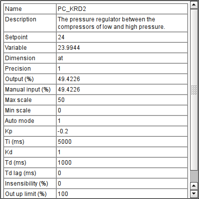
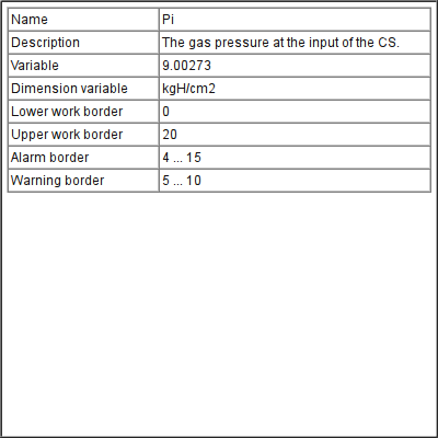
Fig.23. "Passport" widget in the runtime mode.
Linking attributes
| ID | Parameter | Data type | Config | Config template | Description |
| pName | Parameter's name | Address | Input link | Parametr|NAME | Address to the parameter's name to refer to the parameter entirely and get all of its properties |
14. Document panel (doc_panel)
Element, shown in Fig. 24, is used to manage documents and navigate through their histories. The element supports dynamic and archival documents.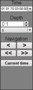
Fig.24. "Document panel" widget in the development mode.
Using - Development
This element should be placed in a logical panels' container of the project's tree. Linking with the parameter is dynamic when called from the document's element.Using - Runtime
Call of the panel is made from elements of the document. The panel provides tools that are somewhat different for dynamic and archival documents.For dynamic document the following tools are provided:
- selection the time of the document's formation;
- selection the size of the document's formation;
- navigation through the document for one or five sizes of it;
- adjustment the time of generation of the document at the current time.
Archival document provides only navigation through documents in the archive by listing them, and display current and overall documents.
Fig. 25 shows examples of this element in the runtime mode: dynamic (left) and archival (right).
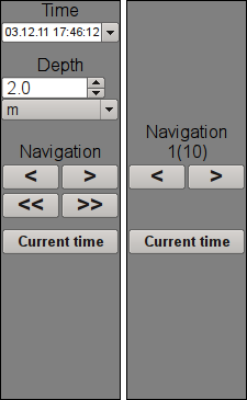
Fig.25. "Document panel" widget in the runtime mode.
Linking attributes
| ID | Parameter | Data type | Config | Config template | Description |
| Dinamic document | |||||
| time | Document time | DateTime | Full link | <page>|time | |
| bTime | Document begin | DateTime | Full link | <page>|bTime | |
| doc | Document | String | Full link | <page>|doc | |
| Archive document | |||||
| n | Archive size | Integer | Full link | <page>|n | |
| vCur | View cursor | Integer | Full link | <page>|vCur | |
| aCur | Archive cursor | Integer | Input link | <page>|aCur | |
| aSize | Archive size | Integer | Input link | <page>|aSize | |
15. Graphics group panel (grph_panel)
Element, shown in Fig. 26, serves to control the "Diagram" widget, it allows you to view trends' history for the required period of time and the desired resolution, the scale, the selection of archiver for display and there are supported trends' presentation in a range of present frequencies or XY.

Fig.26. "Graphics group panel" widget in the development and runtime modes (left to right).
Using - Development
This element should be placed in the logical container of the project's tree. Linking with the parameter is dynamic when called from a diagram element.Using - Runtime
Calling the panel is made from the diagram elements. The panel provides the following tools:- the diagram graphics mode selection: "Graph", "Spectrum of frequencies", "XY";
- time selection of the diagram formation;
- navigation through the diagram for the one or five sizes;
- adjustment of the diagram generation time to the current time;
- information about the time or frequency in the current cursor's position;
- selection of the trend's formation size;
- selection of the archive, used for the trends' presentation;
- control the vertical and horizontal scale of the presentation: zoom in and out the scale, shift the scale up and down, the scale returns to its original value;
- switching of the scale mode by the window drawn by the mouse.
Linking attributes
| ID | Parameter | Data type | Config | Config template | Description |
| tSek | Trend time | DateTime | Full link | <page>|tSek | |
| tSize | Trend size | Real | Full link | <page>|tSize | Temporal size of the trend in the history from the time of the trend. |
| trcPer | Trace period | Integer | Full link | <page>|trcPer | Renewal period of the trend. |
| type | Type | Integer | Full link | <page>|type | Trend's type: "Graph", "Spectrum of frequencies", "XY". |
| valArch | Archiver | String | Full link | <page>|valArch | |
| curSek | Cursor | DateTime | Full link | <page>|curSek | Time of the cursor. |
| curUSek | Cursor, usec | Integer | Full link | <page>|curUSek | Time of cursor, microseconds. |
| sclVer | Vertical scale | Real | Full link | <page>|sclVerScl | The percentage of vertical scale. |
| sclVerOff | Vertical scale offset | Real | Full link | <page>|sclVerSclOff | Percentage of the offset on the vertical scale. |
| sclHor | Horizontal scale | Real | Full link | <page>|sclHorScl | The percentage of horizontal scale. |
| sclHorOff | Horizontal scale offset | Real | Full link | <page>|sclHorSclOff | Percentage of the offset on the horizontal scale. |
| sclWin | Scale by window | Boolean | Full link | <page>|sclWin | Switching to the scaling by window mode. |
| sclWinCtx | Scale: by window save context | Object | Input link | <page>|sclWinCtx | The context of saving of the original scale parameters for return. |
16. Terminator panel (terminator)
Element, shown in Fig. 27, serves to fill the empty place when no item is selected for control.
Fig.27. "Terminator panel" widget.
Using - Development
This element should be placed in the logical container of the project's tree.Using - Runtime
Calling the panel is made from root page "RootPgSo" by changing the signal object or presentation mode.17. Prescription: editing (prescrEdit)
The element "Prescription: editing", shown in Fig. 28, is one of the group frames for working with the prescriptions, which serves for the user-editing of prescription-programs.The prescription-program is a sequentially call of the function's blocks — commands (macros), taking up to five arguments and return string, with result code at begin: "Working" (0), "Finished" (> 0) and "Error" (<0). Calling the step command is made in a loop until the "Working" (0) result is returned. Jump to the next step is made in the case of "Finished" (> 0) result and command "Pass" (2). In the case of error, the "Error" (<0) result, the execution of the prescription is terminated. Prescription's execution making through prescription controller's parameter, which support two mode of prescriptions execution:
- direct into the prescription controller object by commands stored into table "PrescrComs";
- by commands placed in view parameters of the logical controller account it's context, if the logical controller assigned into the prescription controller.
Macro-commands, which user can choose during the formation of a prescription-program, are formed by the programmer of SCADA-system under the specific application area by editing the commands table in the OpenSCADA or parameters list of selected logical controller. Table of commands is placed to the accessible in the specific OpenSCADA configuration database. As an example, this table is placed to the database of the library with the name "PrescrComs". Table of command has the following structure PrescrComs = (name, proc, arg1, arg2, arg3, arg4, arg5), where:
- name — the name of macro-command.
- proc — the text of the macro-command procedure. The procedure in the first line contains the name of the program language, at the moment it is only "JavaLikeCalc.JavaScript", and the program text directly after the language. In the procedure of a macro-command the following context parameters are available:
- rez — result of the command, by default it returns "Work" ("").
- f_start — sign of the first procedure's execution.
- f_frq — frequency of periodic executions of the procedure.
- arg{1...5} — argument's 1..5 value.
- tmp{1...10} — temporary parameter's (step execution context) 1...10 value.
An example of code for the "Timer" command, which does not depend on the application area:
JavaLikeCalc.JavaScript
if(f_start) tmp1 = arg1;
var curTm = tmp1.toReal();
if(curTm <= 0) { rez = "1:Wait elapsed for "+arg1+"s"; return; }
curTm -= 1/f_frq;
tmp1 = max(0,curTm);
rez = "0:Wait now for "+curTm+"s";
- arg{1...5} — label of the 1..5 argument. Only arguments with the label will be displayed when editing the step of the prescription. Into the label you can set minimum and maximum borders of numeric values of the argument into format "{Label}|{min}|{max}".
The several commands with the following names are reserved for special purposes:
- "Error" — is called after an error at the prescription's step.
- "Stop" — is called on stopping a prescription, on successful prescription finishing and on forced shutdown by the user.
The commands-parameters of the logical controller firming as template of parameters of subsystem "Data acquisition", which next used into the logical controller of prescription include mandatory, service and internal attributes:
- rez — command: execution result; the command should be return string view "{rezCode}:{TextMess}", where rezCode have states:
- < 0 — error;
- = 0 — running;
- > 0 — running finish;
- = 10 — running into background with indication to update the running state.
- run — command: execution;
- pause — command: pause the execution;
- start — prescription: start;
- stop — prescription: correct finish;
- error — prescription: prescription finish by error;
- abort — prescription: execution abort by operator;
- arg{1...5} — arguments 1...5. Into an argument name you can set minimal and maximal borders of the numerical value as "{name}|{min}|{max}".
Feature of using the commands-parameters is independent execution and possibility left some commands into background execution, regulators for example.
In the prescription-program formation process through the frame you are working with a table of programs. As an example, this table is placed in the database of the library with the name "PrescrProgs". The table of the programs has the following structure:
PrescrProgs = (name, prgTxt), Where:
- name — the name of the prescription-program.
- prgTxt — program text as an XML-tree. In the step command's tags there is the command name (id) and user-specified values of the arguments (arg1 - arg5). For example, for the four-step prescription:
The "Prescription: editing" frame contains from left to right:
- "Library" — library with a list of programs and library's control tools.
- "Program" — the list of commands-steps of the selected in the library prescription-program with the control tools.
- "Command" — the edit field of the selected step in the prescription, which contains the selection of command and set the values of the available attributes, as well as button to save the changes.
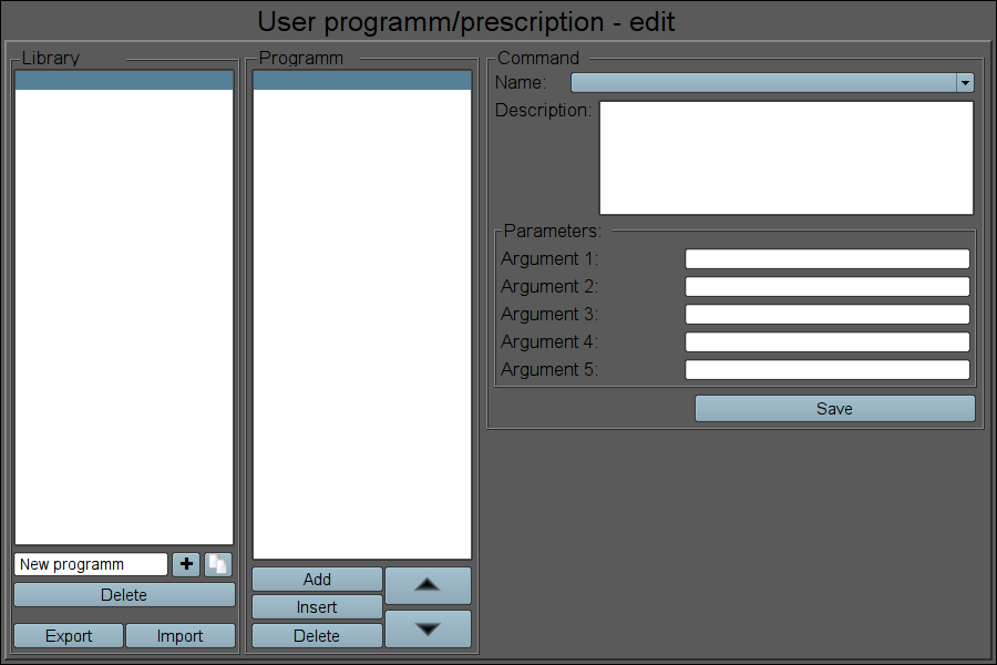
Fig.28. The "Prescription: editing" frame in the development mode.
Using — Development
This frame should be placed in the mnemonic schemes or panels logical container of the project's tree.For correct working of the frame it is necessary to copy an existing tables "PrescrComs" (if the commands mode is not into logical controller) and "PrescrProgs" from the database of the library to the desired database or create a new empty tables there by SQL the commands in the desired DB, for example SQLite:
Blank or copied commands table must be edited and filled with necessary commands in the DB "Table" page, if used first mode of commands, or the logical controller assigned, with commands list, into object of the prescription controller for second mode.
After formation of the tables it is necessary in the links of the frame to set the values of the database with tables and the names of tables themselves, specify the name of the export/import file and set link to object of prescription controller.
Using — Runtime
In the runtime mode, the user can add new prescription-programs, delete, copy and export the existing ones as well as to import prescriptions from other OpenSCADA stations. In the selected prescription-program user can do: add or insert a new step, removing or reposition the selected step. For the selected step of the prescription-program the user can set the command and enter values for the available parameters-arguments of the selected command, and then to keep changes of the step.Fig. 29 shows an example of a frame at runtime.
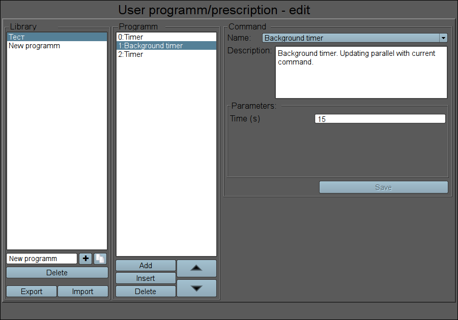
Fig.29. The "Prescription: editing" frame in the runtime mode.
Linking attributes
| ID | Parameter | Data type | Config | Config template | Description |
| Generic configuration | |||||
| dbDB | DB:Database | String | Constant | DB | DB address with tables in view {DBType}.{DBName}. |
| dbProgs | DB:Programs | String | Constant | DB | Prescriptions-programs table name. |
| fileExpImp | Export/import file | String | Constant | File | User's prescriptions-programs file for Export/Import. |
| Linking to prescription controller. The prescription controller realization example you can see into DB Dynamic model "AGLKS" | |||||
| prExtComLs | The list of available commands of prescription | Object | Input link | Controller|comLs | |
18. Prescription: runtime (prescrRun)
The element "Prescription: runtime", shown in Fig. 30, is one of the group frames for working with the prescriptions, which serves to direct execution of programs-prescriptions or observe for execution into external program-prescription executor, previously formed in the Prescription: edit frame.The "Prescription: runtime" frame contains from left to right:
- "Start/stop/skip" — two buttons to start and stop the selected program and button for skip current step execution.
- "Library" — library with a list of programs.
- "Program" — the document of the list of commands-steps of the selected in the library prescription-program. During the execution in this field it is monitored the current state by the appropriate highlight of the steps.
The executable prescription-program may be suspended by pressing the "Pause" button or interrupted by pressing the "Stop" one. Also possible skip step by place to button "Skip" into step execution time.
On the any completion of the prescription-program the message with the parameters of the session is generated, and archiving of the session's document is made. Message with the parameters of a session can be used during viewing the message's archive, or to generate a list of sessions, for example, in the graphics group to go to the history for the session's time. To view the reports history of program's execution you can click on the document and browse on the appearing on the right navigation bar on archival document. By default, the archive of documents is set to the depth of 10 documents.
In addition to full-format frame of prescription execution also provided the simplified, which allow compact control and follow for the prescriptions execution as parts for other frames of a technological process (Fig.30).
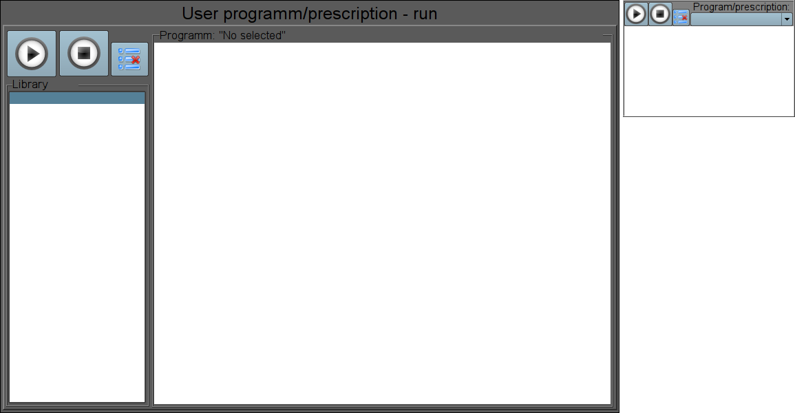
Fig.30. The full-format and simplified "Prescription: runtime" frames in the development mode.
Using — development
This frames should be placed in the mnemonic schemes or panels logical container of the project's tree, for full-format, and to mnemo for simplified.In the links of the frames it is necessary to set the database with the tables and the name of programs' table themselves as in the Prescription: editing, and also link to controller of prescriptions, like to Prescription: editing.
To provide the possibility of finished sessions archiving while the operator switches to another frame, it is necessary for the full-format frame in the project's tree to set the "Page: process not opened."
Using — Runtime
At the runtime mode the user can select the desired prescription-program and run-on execution and then track the execution progress or switch to other frames. Executable program you can pause by pressing the "Pause" button or terminate by pressing "Stop". Thereto you can skip current step execution by press button "Skip". Also the user can review or print reports of previously executed prescriptions, full-format frames, for what it is necessary to press the left mouse button on the document and browse on the navigation bar through the archive of executable prescriptions.Fig. 31 shows an example of the full-format and simplified frames at runtime mode.
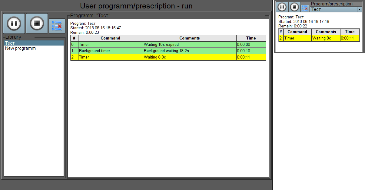
Fig.31. The full-format and simplified "Prescription: runtime" frames in the runtime mode.
Linking parameters
| ID | Parameter | Data type | Config | Config template | Description |
| Generic configuration | |||||
| dbDB | DB:Database | String | Constant | DB | DB address with tables in view {DBType}.{DBName}. |
| dbProgs | DB:Programs | String | Constant | DB | Prescriptions-programs table name. |
| Linking to prescription controller. The prescription controller realization example you can see into DB Dynamic model "AGLKS" | |||||
| prExtCurCom | Controller:current command | Integer | Input link | Controller|curCom | |
| prExtMode | Controller:mode | Integer | Full link | Controller|mode | |
| prExtProg | Controller:program | String | Full link | Controller|prog | |
| prExtStartTm | Controller:start | Integer | Input link | Controller|startTm | |
| prExtWork | Controller:work | Object | Input link | Controller|work | |
19. Acception (accept)
The "Acception" element, presented in Fig. 32 implements a simple operations' acception dialog. The element contains a message with a question and two buttons "Apply" and "Cancel". The dialogue, for example, is used in the frame Prescription: editing to accept the deleting operation.
Fig.32. The "Accept" frame in the development and runtime mode.
Using - development
This widget can be used by the developer to create dynamic interaction frames in operations that require acception by the user. To use it you should add this item to the panels' logical container of the project's tree. For interaction this widget is opened by the frame-initiator the result of it is dynamic linkage of the dialogue with the "event" and "mess" attributes of the frame-initiator. The question message is taken from the "mess" attribute, and the "dlg_Apply" signal is transmitted to the "event" at acception.Using - Runtime
Calling the dialogue is made from the frame-initiator, and closing is made by pressing any button of the dialog. If you click the "Apply" button the "dlg_Apply" signal will be sent to the frame-initiator, by which it can perform the desired actions.Linking parameters
| ID | Parameter | Data type | Config | Config template | Description |
| elEvent | Element:event | String | Full link | <page>|event | It is used to send the "dlg_Apply" event if accepted. |
| elMess | Element:message | String | Input link | <page>|mess | Source of the question message in the dialogue. |
20. Graph's param select (graphSelPrm)
The "Selecting graph's parameter", shown in Fig. 33, implements the dialog to select the data source, often the archive ones, for the formation of the trend in the "Graphics group" frame. Selection is provided from the list, specified in the attribute "Available parameters for selection (allowSelLst)" of the frame-initiator. For the selected source you can specify the name, scale, dimension and the color of the trend.In the "Available parameters for selection (allowSelLst)" attribute the data sources should be placed in the following way:
- DAQ_Arh_addr[:Name[:min:max[:dim]] — where:
- "DAQ_Arh_addr" — address of the parameter for the group linking or address of the attribute with data from the "Data acquisition (DAQ)" subsystem, as well as the address of the values' archive, for example:
- /LogicLev/experiment/prm_F3 — "F3" parameter address;
- /DAQ/System/AutoDA/prm_CPULoad/load — "load" attribute address of the "CPULoad" parameter;
- /Archive/va_LC21_1_var — address of the "LC21_1_var" archive.
- "Name" —the name of the source to display. At the group linking the name will be taken from the "NAME" attribute.
- "min", "max" — display scale. At group linking the scale will be taken from the "min" and "max" attributes, respectively. In the case of the scale absence (min >= max) the auto-scale will be enabled.
- "dim" — dimension of the parameters to display. At the group linking it will be taken from the "ed" attribute.
- "DAQ_Arh_addr" — address of the parameter for the group linking or address of the attribute with data from the "Data acquisition (DAQ)" subsystem, as well as the address of the values' archive, for example:
- <varhs> — template of the group selection, if you specify it all available archives in the system will be included into the selection list.
Example of the "Available parameters for selection (allowSelLst)" attribute's contents:
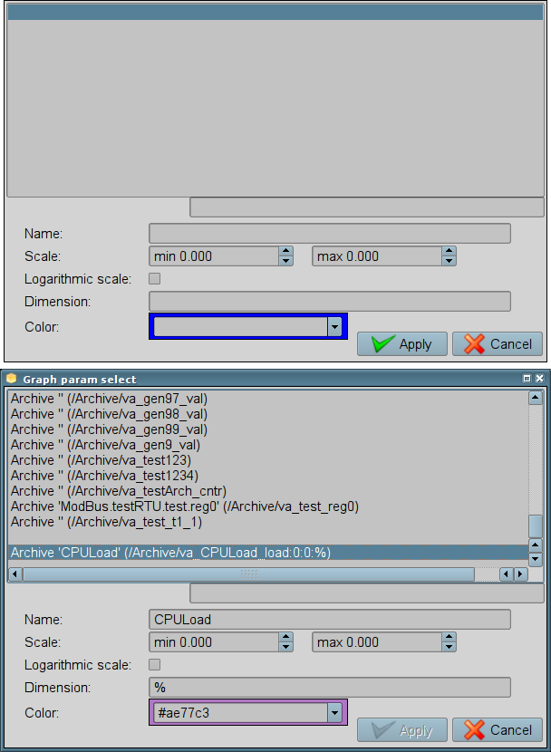
Fig.33. The "Graph's param select" in the development and runtime mode.